Sunday, April 11, 2021

Adobe software list: Which apps do you need? Part 1

 The Adobe software list is long, as the Creative Cloud suite covers pretty much every creative need. Whether you're a graphic designer, web designer, photographer, illustrator, marketing professional or are working in TV and movies, it has most of the tools your profession considers industry standard.

But most Adobe software requires a subscription. Potential subscribers have the choice of signing up to just a single app, the Photography Plan or the whole Creative Cloud suite It's a big decision to make, so it's vital you're aware of exactly what you're buying. Though there are over 50, yes 50, apps altogether, there are 12 main ones you definitely need to know about. 

01. Adobe Photoshop

Photo editing and so much more

Used for: Image editing and manipulation, photo retouching, graphic design, web and app prototyping, 3D modelling | Platforms: Mac, Windows, iPad

Feature-rich
Powerful
Complex
Big learning curve

If you want to edit images, Photoshop is the industry standard; so much so, that the word ‘Photoshop’ has even become a verb. But tweaking photos isn’t all that Photoshop does: it’s also a fully fledged graphics editor. 

Photoshop can be used, for example, to edit and compose raster images, graphics and text in multiple layers; edit and render text and vector graphics; and create and edit 3D graphics and video. This wide range of capabilities means that Photoshop is not just used by photographers and photo retouchers, but also by digital artists, graphic designers and art directors, and even, increasingly, by 3D designers and VFX artists. 

It’s important to note that Photoshop works with raster graphics, in contrast to Illustrator (below), which works with vector graphics. To understand the difference between these, read our guide to common file formats. Also check out our best alternatives to Photoshop.

02. Adobe Illustrator

Create gorgeous vector graphics and illustrations

Used for: Illustration, designing vector graphics | Platforms: Mac, Windows, iPad

While Photoshop has wide and ever-expanding capabilities, Illustrator is much more focused on a specific tasks. It’s essentially a drawing programme based on vector graphics (which contain less detail than raster graphics and are infinitely scalable). As the name might suggest, Illustrator is most commonly used by artists, illustrators and graphic designers, to create everything from simple graphics, such as logos, icons and infographics, to complex illustrations, and everything in-between. Illustrator for the iPad has also recently been released. You can read our review of Illustrator CC here.

03. Adobe After Effects

Used for visual effects, motion graphics, and compositing

Used for: VFX, motion graphics, compositing | Platforms: Mac, Windows

After Effects is a popular tool for visual effects, motion graphics, and compositing. Although you wouldn’t use it to create an entire movie, it might be used by a creative studio to create the kind of simple animations you’d feature on a website, in an explainer video, or on a credit sequence, for example. 

After Effects is also used in the post-production process of film making and television, for tasks such as keying, tracking and compositing, and creating visual effects such as explosions and lightning strikes. As well as being smoothly integrated with other Adobe apps, it also plays nicely with Maxon’s 3D application Cinema 4D. See our After Effects tutorials for help on getting to grips with After Effects.

04. Adobe XD

Adobe's software for web and mobile prototyping

Used for: Web and app prototyping | Platforms: MacWindows, with iOS and Android app for testing

Launched a few years back as Adobe's rival to Sketch, Adobe XD is a vector-based UX tool for prototyping web and mobile apps. In other words, you don’t create the whole app in XD, but use it for visualising the interface and defining how all the different parts function and relate to each other. This makes it easier to get everything working correctly, before you embark on the final coding. Note that XD's starter plan is free, and you don’t need a Creative Cloud subscription to use it.

Thursday, January 7, 2021

Excel 2016 and 2019 cheat sheet


Microsoft Windows may get all the press coverage, but when you want to get real work done, you turn your attention to the applications that run on it. And if you use spreadsheets, that generally means Excel.

Excel is, of course, part of Microsoft’s Office suite of productivity tools. Microsoft sells Office under two models: Individuals and businesses can pay for the software license up front and own it forever (what the company calls the “perpetual” version of the suite), or they can purchase an Office 365 subscription, which means they have access to the software for only as long as they keep paying the subscription fee.

When you purchase a perpetual version of the suite — say, Office 2016 or Office 2019 — its applications will never get new features, whereas Office 365 apps are continually updated with new features.

This cheat sheet gets you up to speed on the features that were introduced in Excel 2016 and Excel 2019, the perpetual-license versions of Excel included with Office 2016 and Office 2019, respectively. In Office 365, Excel has all those features, plus several more. 

Most of the tips in this article apply to both Excel 2016 and 2019 for Windows. Near the end is a section for Excel 2019 only.

Share this story: IT folks, we hope you'll pass this guide on to your users to help them learn to get the most from Excel 2016 and 2019.

Use the Ribbon

The Ribbon interface that you came to know and love (or perhaps hate) in earlier versions of Excel hasn’t changed much in Excel 2016 or 2019. Since the Ribbon has been included in Office suite applications since Office 2007, we assume that by now you’re familiar with how it works.

As in Excel 2013, the Ribbon in Excel 2016 and 2019 has a flattened look that’s cleaner and less cluttered than in Excel 2010 and 2007. The 2016 and 2019 Ribbon is smaller than it was in Excel 2013, the title bar is solid green rather than white, and the text for the Ribbon tabs (File, Home, Insert and so on) is a mix of upper- and lowercase rather than all caps. But it still works in the same way, and you’ll find most of the commands in the same locations as in earlier versions.

Just as in previous versions of Excel, if you want the Ribbon to go away, press Ctrl-F1. To make it appear again, press Ctrl-F1 and it comes back.

You’ve got other options for displaying the Ribbon as well. To get to them, click the Ribbon Display Options icon at the top right of the screen, just to the left of the icons for minimizing and maximizing PowerPoint. A drop-down menu appears with these three options:

  • Auto-hide Ribbon: This hides the entire Ribbon, both the tabs and commands underneath them. To show the Ribbon again, click at the top of PowerPoint.
  • Show Tabs: This shows the tabs but hides the commands underneath them. It’s the same as pressing Ctrl-F1. To display the commands underneath the tabs when they’re hidden, press Ctrl-F1, click a tab, or click the Ribbon display icon and select “Show Tabs and Commands.”
  • Show Tabs and Commands: Selecting this shows both the tabs and commands.
And if for some reason that nice green color on the title bar is just too much for you, you can turn it white or gray. (In Excel 2019, there’s also a black option.) To do it, select File > Options > General. In the “Personalize your copy of Microsoft Office” section, click the down arrow next to Office Theme, and select Dark Gray or White (or Black) from the drop-down menu. To make the title bar green again, instead choose the “Colorful” option from the drop-down list. Just above the Office Theme menu is an Office Background drop-down menu — here you can choose to display a pattern such as a circuit board or circles and stripes in the title bar.

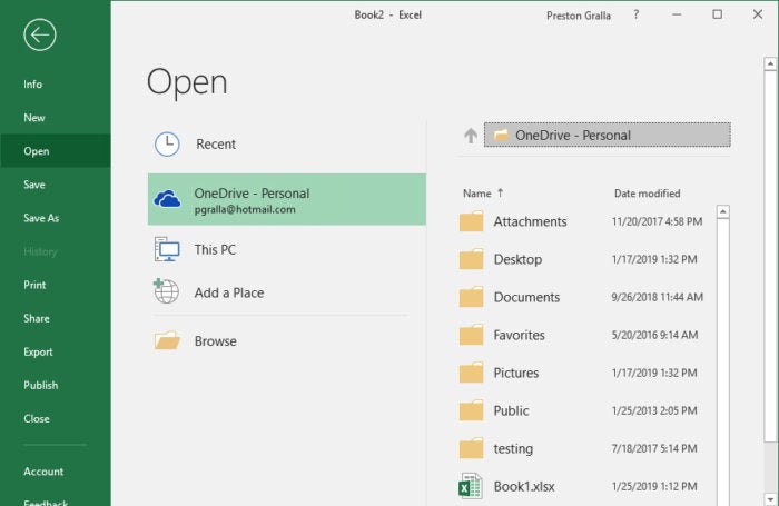
There’s a very useful feature in what Microsoft calls the backstage area that appears when you click File on the Ribbon: If you click Open or Save As from the menu on the left, you can see the cloud-based services you’ve connected to your Office account, such as SharePoint and OneDrive. Each location now displays its associated email address underneath it. This is quite helpful if you use a cloud service with more than one account, such as if you have one OneDrive account for personal use and another one for business. You’ll be able to see at a glance which is which.


excel 2016 2019 backstage

Get things done quickly with Tell Me

Excel has never been the most user-friendly of applications, and it has so many powerful features it can be tough to use. Microsoft has made it easier with a feature in Excel 2016 and 2019 called Tell Me, which puts even buried tools in easy reach.

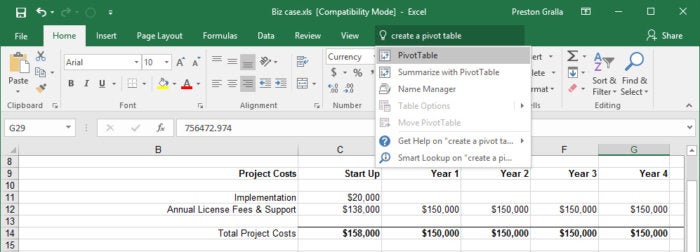
To use it, click the “Tell me what you want to do” text to the right of the View tab on the Ribbon. (Keyboard fans can instead press Alt-Q.) Then type in a task you want to do, such as “create a pivot table.” You’ll get a menu showing potential matches for the task. In this instance, the top result is a direct link to the form for creating a PivotTable — select it and you’ll start creating the PivotTable right away, without having to go to the Ribbon’s Insert tab first.

If you’d like more information about your task, the last two items that appear in the Tell Me menu let you select from related Help topics or search for your phrase using Smart Lookup. (More on Smart Lookup below.)

excel 2016 2019 tell me

Even if you consider yourself a spreadsheet jockey, it’ll be worth your while trying out Tell Me. It’s a big time-saver, and far more efficient than hunting through the Ribbon to find a command. Also useful is that it remembers the features you’ve previously clicked on in the box, so when you click in it, you first see a list of previous tasks you’ve searched for. That makes sure that tasks that you frequently perform are always within easy reach. And it puts tasks you rarely do within easy reach as well.

Use Smart Lookup for online research

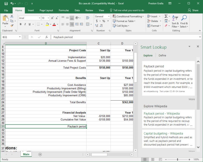
Another new feature, Smart Lookup, lets you do research while you’re working on a spreadsheet. Right-click a cell with a word or group of words in it, and from the menu that appears, select Smart Lookup.

When you do that, Excel uses Microsoft’s Bing search engine to do a web search on the word or words, then displays definitions, any related Wikipedia entries, and other results from the web in the Smart Lookup pane that appears on the right. Click any result link to open the full page in a browser. If you just want a definition of the word, click the Define tab in the pane. If you want more information, click the Explore tab in the pane.

excel 2016 2019 smartlookup

For generic terms, such as “payback period” or “ROI,” it works well. But don’t expect Smart Lookup to research financial information that you might want to put into your spreadsheet, at least based on my experience. When I did a Smart Lookup on “Inflation rate in France 2016,” for example, I got results for the UEFA Euro 2016 soccer tournament, and other information telling me that 2016 was a leap year. And when I searched for “Steel output United States,” Smart Lookup pulled up the Wikipedia entry for the United States.

Note that in order to use Smart Lookup in Excel or any other Office app, you might first need to enable Microsoft’s intelligent services feature, which collects your search terms and some content from your spreadsheets and other documents. (If you’re concerned about privacy, you’ll need to weigh whether the privacy hit is worth the convenience of doing research from right within the app.) If you haven’t enabled it, you’ll see a screen when you click Smart Lookup asking you to turn it on. Once you do so, it will be turned on across all your Office applications.

Chart the new chart types

Spreadsheets aren’t just about raw data — they’re about charts as well. Charts are great for visualizing and presenting data, and for gaining insights from it. To that end, Excel 2016 has six new chart types, including most notably a histogram (frequently used in statistics), a “waterfall” that’s effective at showing running financial totals, and a hierarchical treemap that helps you find patterns in data. (Excel 2019 has two more new chart types, which we'll cover later in the story.) Note that the new charts are available only if you’re working in an .xlsx document. If you use the older .xls format, you won’t find them.

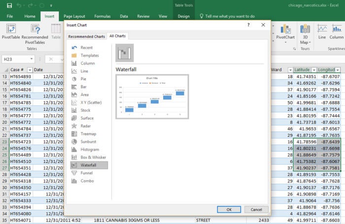
To see all the new charts, put your cursor in a cell or group of cells that contains data, select Insert > Recommended Charts and click the All Charts tab. You’ll find the new charts, mixed in with the older ones. Select any to create the chart.

Excel 2016 all charts

These are the six new chart types:

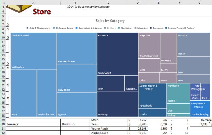
Treemap. This chart type creates a hierarchical view of your data, with top-level categories (or tree branches) shown as rectangles, and with subcategories (or sub-branches) shown as smaller rectangles grouped inside the larger ones. Thus, you can easily compare the sizes of top-level categories and subcategories in a single view. For instance, a bookstore can see at a glance that it brings in more revenue from 1st Readers, a subcategory of Children’s Books, than for the entire Non-fiction top-level category.

Excel 2016 treemap chart

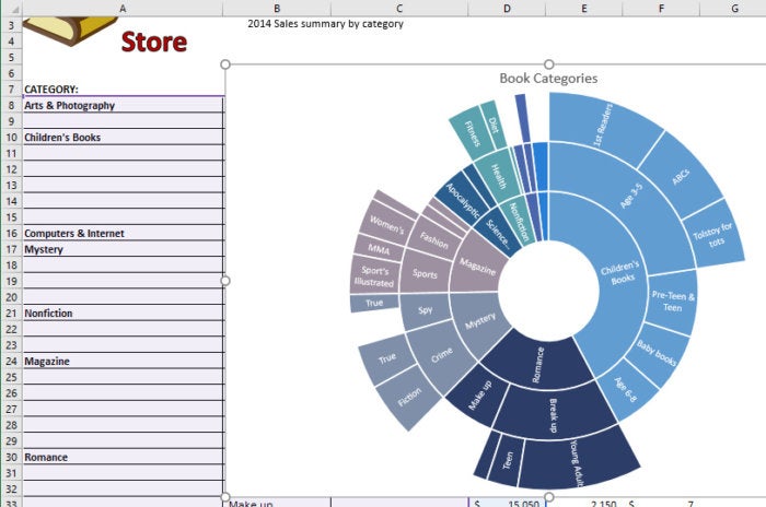
Sunburst. This chart type also displays hierarchical data, but in a multi-level pie chart. Each level of the hierarchy is represented by a circle. The innermost circle contains the top-level categories, the next circle out shows subcategories, the circle after that subsubcategories and so on.

Sunbursts are best for showing the relationships among categories and subcategories, while treemaps are better at showing the relative sizes of categories and subcategories.

Excel 2016 sunburst chart

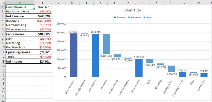
Waterfall. This chart type is well-suited for visualizing financial statements. It displays a running total of the positive and negative contributions toward a final net value.

Excel 2016 waterfall chart

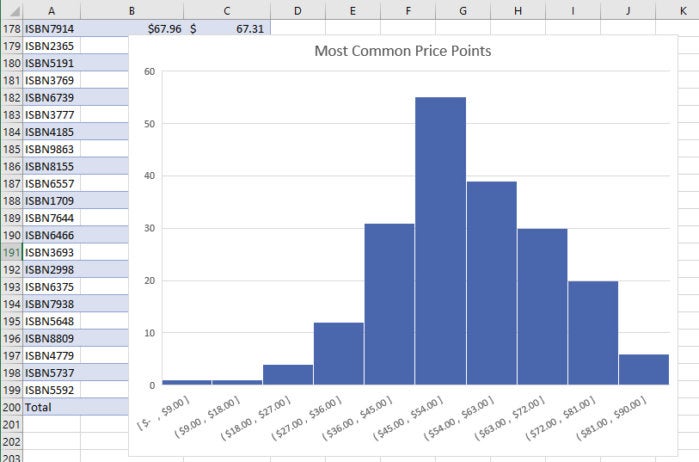
Histogram. This kind of chart shows frequencies within a data set. It could, for example, show the number of books sold in specific price ranges in a bookstore.

Excel 2016 histogram chart

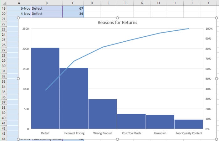
Pareto. This chart, also known as a sorted histogram, contains bars as well as a line graph. Values are represented in descending order by bars. The cumulative total percentage of each bar is represented by a rising line. In the bookstore example, each bar could show a reason for a book being returned (defective, priced incorrectly, and so on). The chart would show, at a glance, the primary reasons for returns, so a bookstore owner could focus on those issues.

Note that the Pareto chart does not show up when you select Insert > Recommended Charts > All Charts. To use it, first select the data you want to chart, then select Insert > Insert Statistic Chart, and under Histogram, choose Pareto.

Excel 2016 Pareto chart

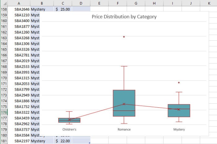
Box & Whisker. This chart, like a histogram, shows frequencies within a data set but provides for a deeper analysis than a histogram. For example, in a bookstore it could show the distribution of prices of different genres of books. In the example shown here, each “box” represents the first to third quartile of prices for books in that genre, while the “whiskers” (the lines extending up and down from the box) show the upper and lower range of prices. Outliers that are priced outside the whiskers are shown as dots, the median price for each genre is shown with a horizontal line across the box, and the mean price is shown with an x.

Excel 2016 box and whisker chart

Collaborate live with Excel Online

When Office 2016 was released, the most trumpeted new feature was real-time collaboration that let people work simultaneously with each other on documents no matter where they were, as long as they had internet connections. (Microsoft calls this “co-authoring.”) When you collaborate with others live, everyone with access to a document can work on it simultaneously, with everyone seeing what everyone else does as they edit.

But Excel was left out in the cold for live collaboration. Only Word, PowerPoint and OneNote had that feature, with Microsoft saying that at some undetermined time, Excel would be given live collaboration.

Many people (myself included) expected that Excel 2019 would get co-authoring features, but that’s not the case. To get live collaboration in the Excel desktop client, you have to be an Office 365 subscriber.

Perpetual-license Excel 2016 and 2019 users can, however, collaborate live using the web-based version of Excel, and I’ll show you how to do that here. Excel Online is less powerful and polished than the Excel desktop client, but it works well enough if you want to collaborate in real time.

To collaborate using the online version of Excel, the file you want to share needs to be in OneDrive, OneDrive for Business, SharePoint or Dropbox. To start, head to Excel Online by going to office.com; then sign in using your Microsoft ID and click the Excel button. When Excel runs, open the file you want to share.

Next, click the Share button at the top right of the screen. A screen pops up over Excel. In it, enter the email address of the person with whom you want to share. If you want to share with more than one person, enter multiple email addresses. Then type in a note if you want.

If you’re signed in with an individual Microsoft account, the people you share the document with can edit the document by default; however, you can give them read-only access instead by clicking the “Recipients can edit” link under the “Add a quick note” area and choosing “Recipients can only view” from the drop-down list. When you do that, you’ll also see an option to designate whether recipients need to be signed in with a Microsoft account to see the workbook. When you’re ready, click the Share button.

When you’re done, a screen pops up confirming to whom you’ve sent the email, and whether they can edit or only read the document. You can click that drop-down to change their permissions or stop sharing the workbook. On this screen you can also send another email to share with others, by clicking the “Invite people” link in the left pane. When you’re done with the screen, click Close.

If you’re signed in with a corporate account, the process is slightly more streamlined. On the initial pop-up screen where you enter recipients’ emails, you’ll see a box that says, “Only the people you specify who have this link can edit.” Click it and you’ll see a screen with more sharing options, including anyone, people in your organization, and people with existing access. There’s also a checkbox to allow them to edit the workbook or not. Make your selections and click Apply. Then, back on the first pop-up, click Send.

Excel now sends an email to all the people with whom you want to collaborate. When they click the “View in OneDrive” or “Open” button, they’ll open the spreadsheet. At this point, they can view the spreadsheet, but not edit it. To edit it, they need to click the Edit in Browser button at the top of the screen or click the Edit Workbook menu and select Edit in Browser. They can then edit the document right in their browser window.

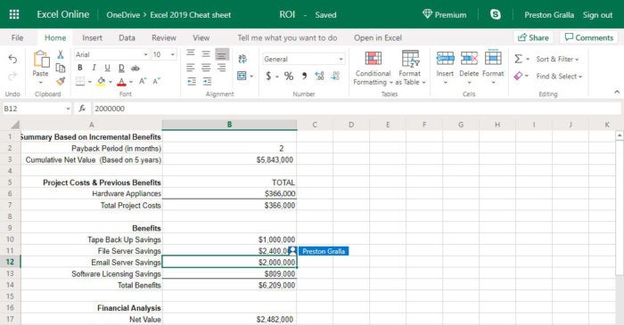
Everyone using the document sees the changes that other people make in real time. Each person’s presence is indicated by a colored cursor, and everyone gets a different color. As they take actions, such as entering data into a cell or creating a chart, their work instantly appears to everyone else.

excel online collaboration

On the upper right of the screen is a list of everyone collaborating on the document. Click a name to see the location of the cell they’re currently working on (for example, G11). You can also hover your mouse over someone’s colored cursor and see their name.

Chat isn’t available. But if you click the Skype icon on the upper right of the screen, you can launch Skype, see if they’re on the service, and communicate with them that way.

Note that even the owner of the workbook must be using Excel Online in order to collaborate in real time. If you have the workbook open in a perpetual version of the Excel 2016 or 2019 desktop client, no one else will be able to make changes in their browser; they’ll see a message saying the file is locked. If you’re using Excel Online, everybody can make changes (assuming you’ve given them editing privileges). When everybody is done making changes and no longer has the workbook open in their browser, you can reopen the file in the Excel 2016 or 2019 desktop client.

8 simple ways to clean data with Excel


Data comes in from an increasing number of sources these days. For decades, data stores were primarily built by good old data entry. But today we cull data from a range of sources including IoT devices, social media feeds, email, and other sources outside of traditional database platforms. That means the data isn’t always free of errors, blank spaces, or junk characters, and it may be inconsistently formatted from source to source.

If you work with data, at some point you will have the unenviable task of cleaning it. Data cleaning, or cleansing, is a method to get rid of syntax errors, typographical errors, and broken or fragmented records; remove duplicate records; and/or reformat data so it’s easier to work with. It’s also a means to extract specific bits of data from a larger set.

The good news is you have a tool at your disposal for automating much of the process, and that is Microsoft Excel. One obvious way to clean up data in Excel is to use the Find and Replace function, but Excel does a whole lot more.

Excel 2016 and later include a powerful set of tools for sourcing and managing data called Get & Transform. (These tools are also available for Excel 2010 and 2013 as a downloadable add-in called Power Query.) If you’re serious about importing and working with data, it’s well worth your time to investigate Get & Transform/Power Query.

But many business users don’t need such advanced features. If you’re looking for a few quick tricks to clean up your spreadsheets, keep reading. Using a few simple commands, you can eliminate blank cells, merge or split columns, deduplicate data, and more in no time.

1. Deduplicate your data with the EXACT and COUNTIF commands

There are multiple ways to remove duplicates in Excel. Let’s start with the most basic. In Excel 2010 and later, under the Data tab is an option labeled Remove Duplicates. Select the entire data set with Ctrl-A or a partial range with a click and drag. Then go to the Data tab, and in the Data Tools group, select Remove Duplicates. If your data has headers, make sure the “My data has headers” option is checked in the dialog box that pops up, and then click OK.

Remove Duplicates does just what it says: Once you click OK, the duplicates are gone. If you want more flexibility, there are other options to flag duplicates so you can decide what further action to take.

The first is the EXACT command. It compares any two columns and returns TRUE for an exact match or FALSE for no match. The syntax is:

=EXACT(first_cell,second_cell)

So in comparing a sheet with two columns of phone numbers, with the phone numbers in columns B and C, in cell D2, enter:

=EXACT(B2,C2)

When you press Enter, a value of TRUE or FALSE will appear in cell D2. Now you need to duplicate the formula for the rest of the rows in the data set. Copy cell D2, select all of the cells below it to the bottom of the data set, and hit Enter. Your formula will be duplicated all the way down, always returning results from the data in its own row. You can then sort the rows by which are true and false and act accordingly.

If you have a large data set, there’s an even better shortcut for pasting the formula down the column: With the cell containing the formula selected, hover your cursor over the lower right corner until you see the cursor change into a thin plus sign. Double-click, and the formula will fill in the rest of the column.

EXACT is great for comparing cells within the same row. The COUNTIF function is great for comparing cells within the same column. It is used for counting cells within a specified range that meet a certain criteria or condition. COUNTIF uses the following syntax:

COUNTIF(range, criteria)

Range is straightforward: it is the number of rows to count, like A2:A100 to check 99 rows. Criteria can be almost anything. Say you want to determine if the same entry can be found in a column of data. Entering =COUNTIF(A:A, A2)>1 in cell B2 will tell if the entry in cell A2 is duplicated after the first instance. Then copy the formula and paste it into the rows you want to check.

FALSE is found only in the rows where there is a single entry. TRUE is returned for the many CPUs, GPUs, hard drives, and NICs, but FALSE shows for sound card, SSD, memory and motherboard because there is only one entry for each.

You can also use COUNTIF do a count of items in a column. Using a similar list of components as above, we counted the number of times each component appeared by entering =COUNTIF(B2:B26, "CPU") in cell E2, then changing the formula in each row down column E to look for the different component names.

Now you know the number of times each word or phrase, in this case computer components, appeared in the column. From there you can take whatever steps you deem appropriate.

2. Clear out extra spaces with TRIM

The TRIM command is a major cleaning function. It helps you to find and remove junk characters, most notably extra spaces, leaving only a single space between words and no space at the start or end of the text.

The syntax is quite simple:

=TRIM(cell)

Enter the =TRIM command in the column next to the one you want to clean. So to clean column A, in cell B2 enter =TRIM(A2) for the first cell under the header. Then copy and paste the B2 formula down the column to process all of the other rows of messy data.

If in addition to extra spaces your data contains line breaks and non-printing characters, use =TRIM(CLEAN(A2)) to delete the first 32 non-printing characters in the in the 7-bit ASCII code system.

TRIM has its limitations. TRIM is useful when cleaning up text that has come from other applications or environments, because it only removes the ASCII space character, but note that it cannot remove non-breaking spaces used in web pages.

3. Replace junk characters with SUBSTITUTE

Find and replace isn’t the most elegant of replacement tools, because it can only do one character or word at a time. A faster way to do multiple characters at once is to use the SUBSTITUTE function. The syntax is as follows:

=SUBSTITUTE(cell, old_text, new_text, instance_num)

All these elements straightforward: “cell” is the cell that contains the string you want replaced; “old_text” is the sequence of characters that you want to replace; “new_text” is what to insert; and “instance_num,” which is optional, tells Excel how many times it should replace “old_text” if it finds more than one instance.

So let’s say you have goofed up cells that list the year as 2018 and want to replace all of the 2018s with 2019. Use:

=SUBSTITUTE(A2, "2018", "2019")

Then copy and paste the formula down all of the rows to make the replacement. A few more examples:

  • =SUBSTITUTE(A1,"A","C") replaces A's with C's
  • =SUBSTITUTE(A1,"A","a") replaces uppercase A’s with lowercase a’s
  • =SUBSTITUTE(A1,"A","Z",1) replaces the first A in the cell with Z
  • =SUBSTITUTE(A1,"#","") replaces # with nothing

Those are pretty simple and can be done with the regular find and replace. But SUBSTITUTE does much more. In the following example, we clean up and reformat telephone numbers to strip out all extraneous characters, then use Excel's formatting to convert the numbers into proper format. Phone numbers can be fouled up on data entry in a variety of ways. SUBSTITUTE lets you cover all the bases at once.

The formula below uses a series of nested SUBSTITUTE functions to strip out open and close parentheses, hyphens, spaces, and periods in cell B2:

=SUBSTITUTE(SUBSTITUTE(SUBSTITUTE(SUBSTITUTE(SUBSTITUTE(B2,"(",""),")",""),"-","")," ",""),".","")

The formula runs from the inside out, with each SUBSTITUTE removing one character, and each character in quotes. The innermost SUBSTITUTE (just before the “B2”) removes the left parenthesis symbol — i.e., it replaces the symbol with nothing:

SUBSTITUTE(B2,"(","")

The next SUBSTITUTE out removes the right parenthesis symbol, the next one out after that removes the hyphen, and so on. This can get confusing, because each SUBSTITUTE requires the text to be replaced in quotes (“old_text”), followed by the empty set of quotes (“new_text,” which in this case is nothing), followed by a closing parenthesis — and all these elements are separated by commas. You can add as many SUBSTITUTEs to remove as many characters as you want.

Pasting the formula down the column results in a column of cleaned, unformatted numbers — column C in the screenshot above. To get them formatted as in column D, copy all the cleaned numbers and paste them into the Formatted column. With the numbers in column D still selected, find the Number section in the middle of the Ribbon’s Home tab and click the drop-down list showing “General.” Select More Number Formats from the bottom of the list. In the dialog box that appears, select Special from the Category list on the left, select Phone Number from the Type list in the center, and click OK.

4. Edit capitalization with PROPER, UPPER, and LOWER

Text can be changed to all caps, no caps, or proper case (a.k.a. title case) the same way TRIM lets you remove spaces. This has to be done one column at a time and does not work on rows.

First, create a new column, preferably next to the one you are cleaning. Let’s say data entries start at cell A2. In B2, enter =UPPER(A2)=LOWER(A2) or =PROPER(A2) and hit Enter. In B2, the data from A2 will be changed to the form you chose. Then copy the formula down the rest of the column. You can see the results for all three commands in the screenshot below.

5. Merge or split columns

Let’s say you want to merge columns A and B into one. You might want to merge first and last name together into one cell, or perhaps cities with two names (e.g., New York) got split into two cells and you want them in one cell.

In a new column, place your cursor in cell C2 (assuming you have a header in row 1) and type:

=A2&" "&B2

The quotation marks are to put a space between the two cell entries. If you don’t want a space, then it’s simply:

=A2&B2

Then copy the formula down the rest of the column.

The reverse of merging cells is splitting text inside one column into two or more columns. For instance, your data might include first and last names of customers in a single column, but you need to separate them so that you can sort them alphabetically by last name. When data is obtained from a non-structured source, like a text file, you might even find an entire line of data entries crammed in one cell.

You can split this text into multiple cells by using Text to Columns function. We’ll demonstrate with the first and last names example. Select the cells you want to parse, then go to the Data tab on the Ribbon and in the Data Tools section, click Text to Columns. This opens the Convert Text to Columns Wizard.

On the first screen, the wizard determines that data is delimited — i.e., the items in each cell are separated by spaces, commas, and/or other characters. Choose Delimited if it is not already selected and click Next. On the next screen you can select one or more delimiters to have the wizard look for. Your options are Tab, Semicolon, Space, Comma, or Other, where you can enter an oddball character such as a pipe (|). Check the appropriate box(es). A preview box below shows how the data will be split.

Click Next, and the Column data format screen will come up, allowing you to select the data format for the new columns or go with the default, which is that the new columns will have the same format as the original cell. Click Finish, and text in the original column will now appear in two columns.

As the second image shows, it’s not foolproof: Robert De Niro and Michael J. Fox got split an extra time. But two minor fixes are easy to make considering the time saved splitting out the first and last names.

6. Find and replace blank cells

Blank cells can mess with analytics if not treated beforehand. Cells should at least have 0, null, or Not Available entries. There is a way you can select all the blank cells at once in Excel.

  1. Select the entire data set.
  2. Press F5. The Go To dialog box appears.
  3. Click on the Special… button to open the Go To Special dialog box.
  4. Select the Blanks radio button and click OK.

This selects all the blank cells in your data set. If you want to enter 0, null, or Not Available in all the empty cells at once, just type it and press Ctrl + Enter.

7. Extract partial values from a column

You can extract partial values from a cell from the left, right, or middle using the LEFT, RIGHT, and MID commands. The syntax for the first two is =LEFT(cell,length) and =RIGHT(cell,length). Say you have a column with 9-digit ZIP codes and you’d like to separate things out, so the main five digits are in one column and the extended ZIP is in a second column.

If your ZIP code list starts in cell A2, in the cell next to it (B2), enter:

=LEFT(A2,5)

In the next column over, use:

=RIGHT(A2,4)

As always, copy the formula in the first cell of each column down the column. And voila! You have split out your ZIP codes.

ID is a little more complex; it requires one more digit:

=MID(cell,startnum,length)

Let’s say you have cells with complete phone numbers but want only the prefix — the first three digits after the area code. Again assuming the data starts in cell A2, you would use =MID(A2,4,3) in cell B2. This tells Excel to count to the fourth digit in the cell and extract three digits. Once again, copy the formula in the first cell down the column. From there you can sort by phone number prefix, something done in targeted marketing.

8. Unpivot your data

Horizontal columns with aggregate data (a.k.a. crosstab format) don’t lend themselves well to being converted to a PivotTable; vertical rows with separate data points (a.k.a. tabular format) do. The Unpivot command takes a data set that stretches horizontally across the top of the report and makes a new chart where the original horizontal columns are separated into individual data points in vertical rows, which is the best way for further analysis with PivotTables.

Unpivot is one of the tools in the Get & Transform/Power Query toolbox. It’s built into Excel 2016 and later, but to use it in Excel 2010 or 2013, you need to download and install the Power Query add-in.

Let’s use a regional sales chart sample, broken down by month. First, make sure the data is in table format, which looks like this:

If it’s not, put your cursor in any cell in the data set, go to the Insert tab on the Ribbon, click the Table button near the left end of the Ribbon, and click OK. Next, in Excel 2016 and newer, click the Data tab on the Ribbon, and then in the Get & Transform area, click the From Table/Range button to bring up the Power Query Editor window. Select the appropriate columns by clicking the first column you want to unpivot, then holding down the Shift key and clicking the last column. Click the Transform tab in the Power Query window’s Ribbon and select the Unpivot Columns button. Or you can right-click on one of the columns and select Unpivot Columns.

In Excel 2010 or 2013 with Power Query installed, go into the Power Query menu and select From Table/Range; a Power Query window opens. Select the columns with the figures, not the header information, then the Transform menu item, and click Unpivot Columns — or right-click one of the columns and select Unpivot Columns.

Your horizontal data is now vertical, ready for PivotTable manipulation. In the Power Query Editor’s Ribbon, go to the Home tab and click the Close & Load button all the way to the left. The tabular version of your data will appear on a new worksheet by default. If you’d rather add it to an existing worksheet (or display it as a PivotTable or PivotChart), instead click the small down arrow in the corner of the Close & Load button, then select the Close & Load To... option from the menu that appears, designate where and how you want the data displayed, and click OK.

That’s just one example of what Power Query/Get & Transform can do. It is designed to connect to data sources, then combine and clean that data in one fell swoop through simple wizards. If you’re serious about importing and analyzing data from various sources, Microsoft has some helpful tutorials to get you started with the tools.

Adobe software list: Which apps do you need? Part 1

  The Adobe software list is long, as the Creative Cloud suite covers pretty much every creative need. Whether you're a graphic designer...

Most View